- September challenges its weak reputation with the S&P 500 showcasing exceptional strength.
- An upsurge in outperforming stocks emphasizes robust market breadth, the strongest since 2002.
- Delve into five crucial charts unveiling the robust momentum of the S&P 500 as 2024 approaches its final quarter.
September, traditionally dubbed an underperforming month for the S&P 500, has surprisingly emerged as a star performer this year, set to mark one of its strongest September runs in recent history.
The surge in the number of stocks outpacing the S&P 500 to the highest level since 2002 reflects the market’s exceptional resilience.
With bullish signals permeating the atmosphere, let’s explore five pivotal charts that depict how the S&P 500 has disrupted historical norms this month and potentially carries its momentum into the year’s end.
Chart 1: S&P 500 Continues Setting New All-Time Highs
The S&P 500 recently scaled three new all-time peaks in a single week, bringing its tally for 2024 to an impressive 42.
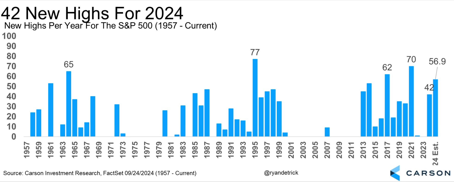
This chart vividly portrays the frequency of all-time highs striven for and conquered by the S&P 500, accentuating its stellar performance this year amidst the shadow of September’s historical trends.
Chart 2: Count of Positive Weeks throughout the Year
The index’s remarkable resolve is seen in its streak of 35 weeks with positive returns over the past year, translating to an impressive 67% success rate. This streak is a clear testament to the robust market momentum.
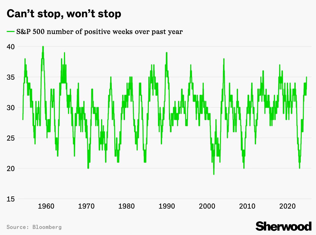
Chart 3: Volume of Stocks Outperforming the Index
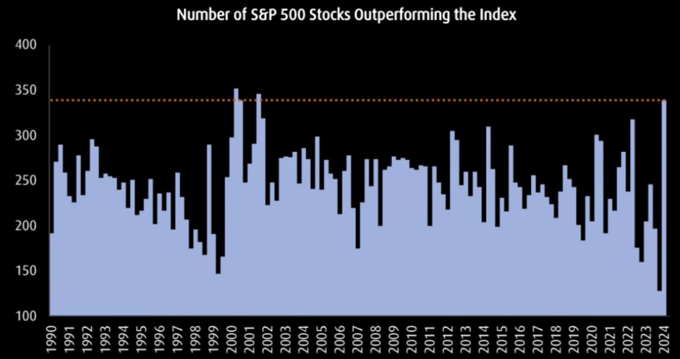
This illustration showcases the proportion of stocks outshining the S&P 500, hitting a pinnacle last seen in 2002 and signaling a robust market breadth.
Chart 4: Disinflation Patterns
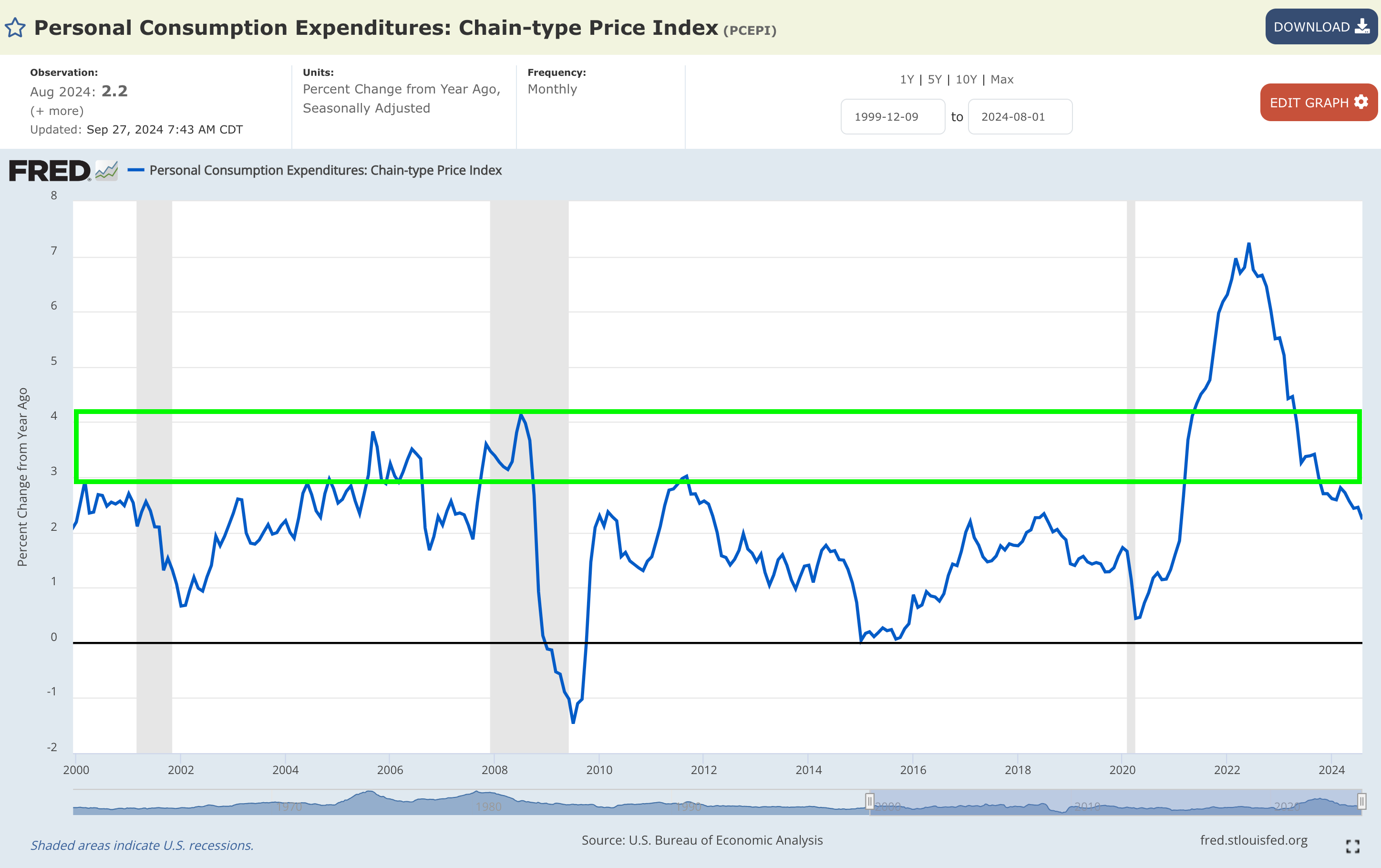
Observing the year-on-year disinflation rate tracked by the , we notice a slight dip from +2.45% to +2.23%, reaffirming the prevailing disinflationary trajectory.
Chart 5: Dynamics of the Labor Market
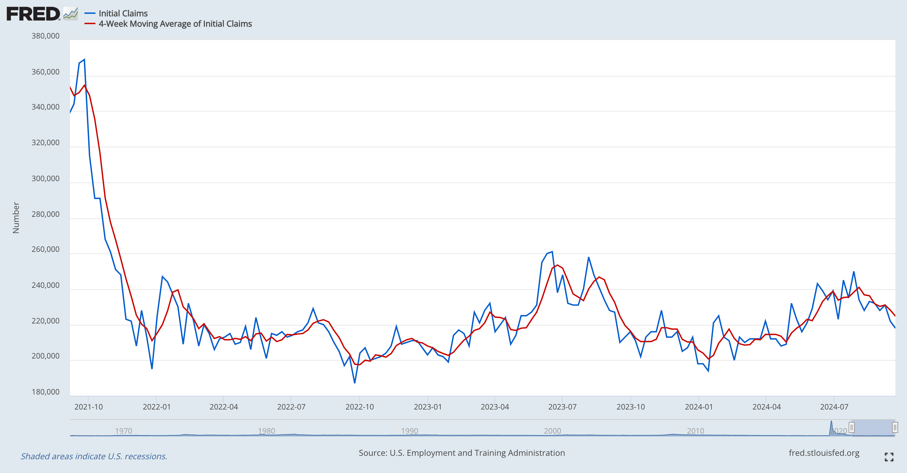
Visualizing the data, we trace the labor market’s journey since September 2021, displaying a swift decline succeeded by nearly three years of lateral movement, dispelling concerns of substantial deterioration.
Final Thoughts
Focusing on these graphs and data is crucial as the ongoing bullish trend exudes undeniable strength.
This juncture urges each of you to evaluate the voices that have guided your decisions in recent times.
If you maintained a bearish stance and remained on the periphery, ponder on who continues shaping your market perspectives today.
If someone persistently proclaims erroneous bearish narratives, ask yourself: why should they command your attention any longer?
***
Disclaimer: This article serves as an informational piece only. It does not aim to incite asset purchases in any form and does not constitute a solicitation, offer, recommendation, or suggestion to invest. Remember, all assets carry numerous evaluations and substantial risks, hence all investment decisions and associated risks lie solely with the investor. We do not provide any investment advisory services.
